Picture heavy post this time guys, once again I apologise for the quality of my photos, I'm working with the standard camera I have.
So most of my hobby time recently has been devoted to painting up Prince Yriel and my Harlequin squad to a standard that I believe does the beauty of the miniatures justice. This is taking a while because my painting is on the whole quite average, but I find that doing this I've really improved for the reason that I've been trying new techniques and they're paying off. So I'll take you into a little look at the painting I've been undertaking and the discoveries I've made.
So to start, Yriel:
His cape is layered similarly, regal blue with an enchanted blue drybrush to raise the colour a little, topped off with an ice blue drybrush highlight on the raised folds to give the colour depth. The lighter bits in the picture are ice blue, there is no particular light in my room (just the sun through the curtains).
So this is his current stage. I've layered his hair with three colours as well (power of three, I noticed this as I was doing it...odd). It's black ink, with scorched brown bottom coat and a vermin brown drybrush. It keeps his hair dark to make him seem more sinister than a blonde Eldar, but it isn't too black.
My most effective parts however are the gems. I rifled through some old white dwarves to find a specific 'Eavy Metal masterclass on painting gems which works brilliantly. Paint the gem in the colour you want it, paint the top of the gem (in a crescent moon kind of shape following the edge of the gem) one shade darker, the bottom of the gem one shade lighter and then, using skull white, paint a little slightly curved dot on the top right to show light reflecting. I wish I could show you this up close but my camera can't deal with it. For examples:
- Red Gem: red gore base, chaos black top, blood red bottom, skull white dot
- Bue Gem: enchanted blue base, regal blue top, ice blue bottom, skull white dot.
These are the two I used and they both worked brilliantly.
Next up, the Harlequins:
These guys are both a joy and a pain to paint. They look great when you do it, but are a pain to actually do. I've decided to stick close to the standard GW examples on the box as that's technical enough to stretch me.
The checker patterns were the worst. I advise DO IT BEFORE ASSEMBLING THE FIGURE. It may sound straight forward but I got carried away gluing before I started painting and trying to reach some of the areas to do checkers was a nightmare. Particularly in the example above. They are just pencilled on however (a led pen is good as you can extend it to reach around legs etc) and done in alternate blood red and ice blue.
The yellow is actually something I'm quite pleased with. I bought a pot of Yriel Yellow (I had to, I was painting Yriel) but when I did the ribbons it seemed too bright. To counter this, one or two coats of devlan mud really brings the colour down to something striking but muted. This stops it seeming too vibrant or over the top. Even for Harlequins. I applied this technique to Yriel's yellow sashes as well.
The black is just chaos black. I watered it down a fair bit though to take the edge off and also highlighted any raised creases with a small drybrush of codex grey to stop it looking really flat and one dimensional.
The small yellow 'spades' are all done free hand in Yriel yellow. It wasn't too hard but sometimes needed a couple of coats to get it to stand out against the black.
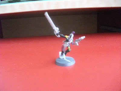
This guy was my test piece, hence he's more finished than the others. The green sashes/mask is an old paint called glistening green (my absolute favourite paint ever). I found that if left, it separated into paint and greenish water and the water alone made a very nice, smooth, light ribbon colour.
My best discovery however is that the new paint, Gehanna's Gold also separates. However, it separates into a gold paint-blob-thing and a red water. The red water shines slightly and if used on its own creates and incredibly delicate, pink/red colour than I used on this guy's mask and sword. They even sparkle slightly. It also works as a wash as his gun is chainmail with this wash over it to make it slightly pink and slightly showy (as harlequins are). I must investigate whether any other paints separate in useful ways. Don't always shake them first I say, check for this before using any paints.
So that's a little look into what I've been doing for the past...month actually. Wow. I've also been battling a little and vassaling with my Eldar to get a good feel about all the units in the book. I'm particularly loving the Avatar and the Mantel-wearing Jetbike Farseer. More on this to come.
I am leaving you for a while however as I'm off on my sunny summer holiday to Germany, so my infrequent posts will become even more infrequent for about 3 weeks. I will return however, with more Eldar-y goodness I can assure you.
Did I mention that I love Elves?


No comments:
Post a Comment